Posted by: rick.ca
« on: February 14, 2013, 11:30:13 am »It seems like I have all the colors for the list except the default black one :/
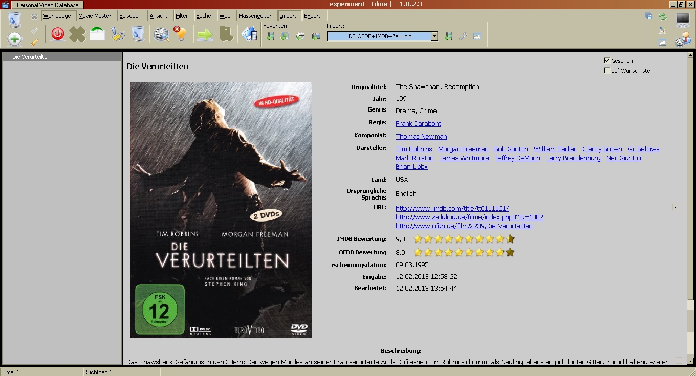
It seems there's a reason for that. The users sets preferences for background colours to be used for the item's status. When any item is selected, the program uses a darker shade, and changes the font from black to white. Perhaps allowing a variable light/dark font would help, but the dark skin creator already has a difficult problem—how to choose a set of 'dark' colours, each of which can have a darker shade, and all of which are distinguishable from one another.
I'm still not sure, but it seems the other question has to do with the border around the list and info panels. I've always assumed that, like other parts of the program UI, are Windows elements that cannot be changed by the program. Some can be changed by changing Windows settings. Perhaps others can be changed by hacking the program, but that seems like a bad idea. In any case, it's difficult to see how the skin engine has much to do with this—unless the 'improvement' is to make the entire UI skinnable.
Quote
I do have plans in extending the skin engine in future.
Here's my vote for the live WYSIWYG drag 'n' drop object-oriented editor for the entire UI.


