 | On this page: Introduction Editing Fonts and Lists Tables Tips Screenshots |
Introduction
This is a template for creating new topics. It creates the basic navigational elements that should be consistent from topic to topic. These include:
- An On this page: summary at the top of the page. The items in the summary are linked to the subheadings.
- Page navigation controls (arrow icons) attached to each subheading (for moving from subtopic to subtopic).
- Topic navigation controls (home, previous, top, next) presented as a footer.
This is also a style guide for explaining and illustrating style elements that should be consistent throughout the Help documentation.
Start a new topic by saving this template with the topic name XXXX Topic Name. "XXXX" is a numeric the board style will use to place topics in the correct order, but not display. Note the URL of the new topic, and then add it to the TABLE OF CONTENTS. Use the template by replacing the text between the subheadings, and using the BBCode examples as appropriate.
Editing
The SMF edit box is too small for editing these relatively large, heavily formatted topics. Use a good text editor like UltraEdit (commercial) or Notepad++ (freeware). Even for minor revisions, it's more efficient to make the change in an editor, and then cut and paste the entire contents into the edit box—replacing what's there (i.e., in the edit box Ctrl+A to select all, then Ctrl+V to paste your new version from the clipboard). These editors can also highlight and insert tags or style templates (e.g., a pre-formatted table).
Using an external editor also allows for maintaining a revision history of source files. When revisions to a topic are complete, save the file with the name...
XXXX Topic Title YYYY-MM-DD (source).txt
...and attach the source file to the topic.
Fonts and Lists
For clarity, some terms should be identifiable by appearance, as follows:
- Command (may also be used for emphasis)
- Significant object (may also be used for Headings)
- Field name
- WARNING: Message
- Comments (on adjacent normal text)
- PVD (meaning of abbreviation in tool tip)
As above, use the default bullet-type list for a point form list...
- point1
- point2
- point3
...while an ordered list should be numbered:
- step1
- step2
- step3
Tables
Tables can be a pain to create and maintain, but the result is much easier to read. Here are some tools that make the job much easier:
| Tool | Source | Description |
| Template | Text editor | This table was created using the template below. |
| Table Generator | Teamopolis | Enter data to webpage and let it create the table. |
| HTML Converter | Sea Breeze | Copy existing HTML to webpage and let it convert the table. |
| R1C1 | R1C2 | R1C3 |
| R2C1 | R2C2 | R2C3 |
| R3C1 | R3C2 | R3C3 |
| RxC1 | RxC2 | RxC3 |
The first row is formatted as column headings, and these are padded with non-breaking spaces to separate the columns. To be effective, this padding would have to be used in the row where the data is widest. Rows are easily added by copying the last row of BBCode before using it.
Tips
Icons can be used to draw attention to points otherwise easily missed.
| Suggestions, tips or checklist. In addition to those used here, the following icons are available... ...for use as suggested by their tool tips. | Spheres icons courtesy of...  |
| Warning or caution (do not also use red). |
| How should an answer to FAQ be presented? Like this.  |
Screenshots
Screenshots are very useful for explaining how things work and keeping the reader oriented to their own experience of the program. Do try to strike a good balance between images and text. Unless illustrating an advanced feature or customization, shots should be of standard/default views and skins—so as to not confuse new users. Save the shots at full resolution in PNG or JPG format. Upload them to F-TP://videodb.info//images. They will then be available at ht-tp://www.videodb.info/help/images/.
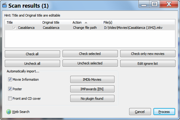 |
|
[attachment deleted by admin]
 Style Guide and Topic Template (attached)



Reserved.